Pharmacy App
Introduction
Our client in the pharmacy space came to us to look over the design of their mobile app since they saw an opportunity in the growing mobile segment. The client had started a new initiative to move away from having a web-based app to native app development, enabling better user experiences for their customers.
Our role was to take all current features and package them into a native design with better user experiences aligned with the newly established brand guidelines.
During this project, I was part of the entire process, from wireframing and prototyping to user testing and designing micro-interactions.
**Note, this project has been revised to not have any branding on it and does not reflect the outcome of the client project.
Role
Interaction Design Intern
As an interaction design intern, I worked with the team to design wireframes and interaction concepts. As the only native speaker on the team, I was also in charge of conducting user testing.
Spring 2018
Team: 5 Designers and 2 Developers
About the project
During the initial workshop with the client, we made the initial decisions for the project's scope. We should develop a "Minimum Lovable Sellable Product" that includes the features and functionality of the current app and explore new features that further enhance the user experience. The app should be designed to allow us to add features and functionality in the future.
The project deliverables will be a draft of the UX patterns and design system and a roadmap for the app.
The project in numbers

Documenting “As is”
We conducted a heuristic evaluation of the current app to find the current flows, patterns, features, and screens. We used this information to create high-level building blocks and views that allowed us to move things around and play with the sitemap of the app.
Research
I the starting phase of the project, we read through the research material that our client had provided. This was a good starting point for what the customer's needs were. We added to this research by conducting user interviews with the target users to understand more of the context from a design perspective. These are some of the feedback we got.
“I don’t explore. It is not a positive feeling to go to the pharmacy. Make it easy for me to get my task done.”
“I want a good overview.”
“It is important for me to easily check the status of my prescriptions”
“When I pick up my prescriptions, I often buy other things as well.”
“It should be simple and quick”
“I come back for the same things every time”
Benchmarking
We also conducted benchmarks on competitors and other e-commerce apps during the heuristic evaluation to find design patterns and flows that could work for our vision of the app. Since we are redesigning the app to be native, we looked at the most popular apps on the iOS app store and some of the apple designed apps to find common patterns and micro-interactions that we could use to enhance the feeling of using a native app.


Prototyping
We created clickable prototypes throughout the entire design process to try out our designs and flows as fast as possible. This allowed us to iterate on the design and patterns before nailing down the visual language. We used the rough prototypes to test our designs internally to validate the ideas and concepts before conducting user tests on the final target group.

User Testing
We conducted user testing with the target group provided by the client. The primary purpose of the tests was to get a general sense of the navigation flow and get into more details on the prescription pages. Overall, we found that android users had issues going to previous views on our iOS prototype and some feedback that the e-commerce sections of the app were not as interesting to most of our participants.
We got some excellent feedback on the general direction and details that were hard to understand for our users for the prescription pages. The most common response was that they did not even know that they could manage their prescriptions in the app today. With the new insight, we promoted the prescription functionality in our designs and concluded that a first release of the app might only use the prescription features.

Comments from users after trying our final prototype:
"It looks friendly for being a pharmacy app."
"It feels simple to use."
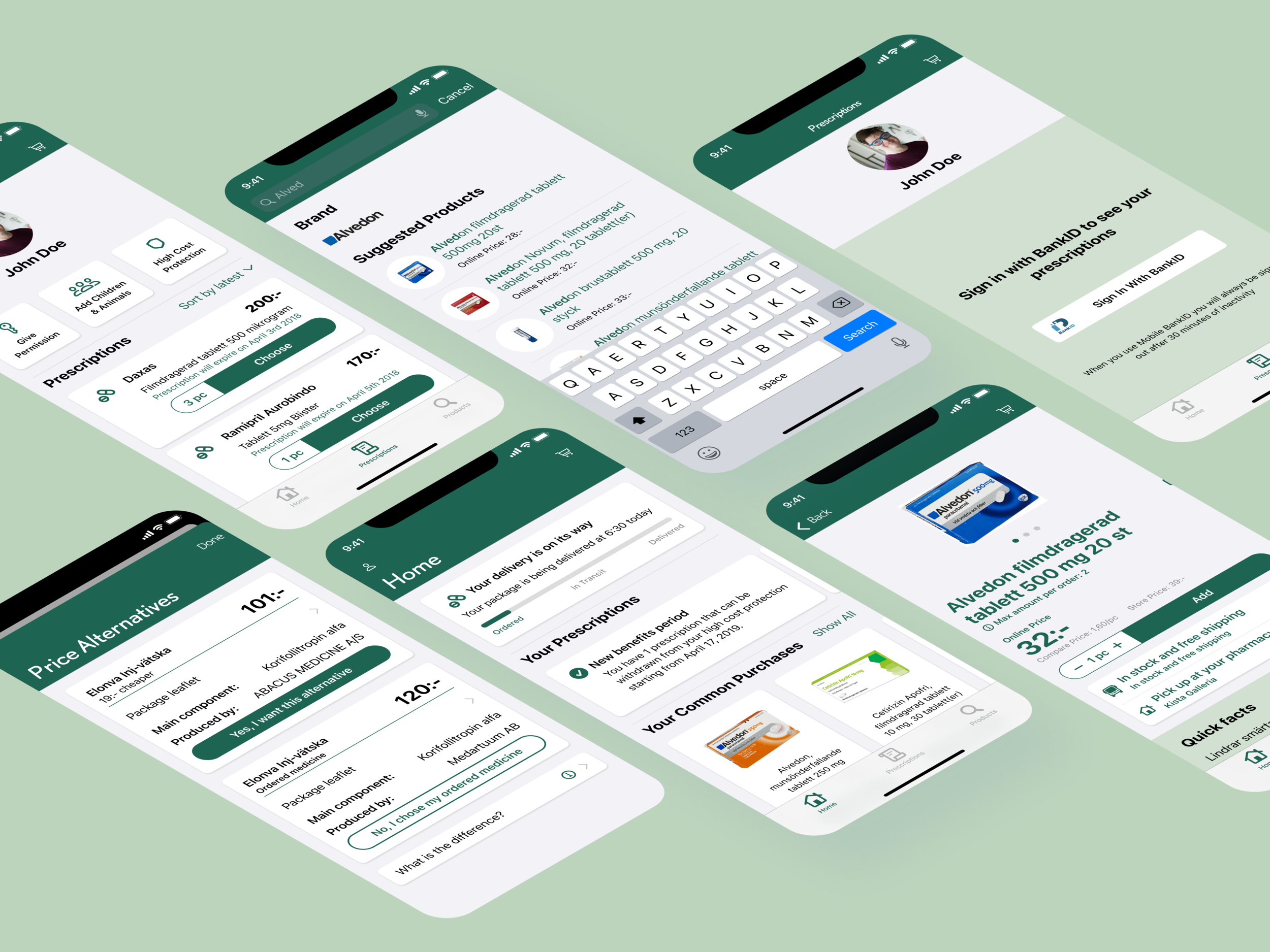
Final Design
Navigation

Tab bar
We decided to use a tab bar as the primary navigation element to focus on the three main areas of interest and make the app feel native to the device.
Home Screen

Centered around the customer
Dynamic and relevant information
Easy to find closest pharmacy

Prescriptions

Manage your prescriptions
Manage your family
Give permissions
See your high cost protection

Products

Search in focus
Multiple entry points
Supports efficient search and product exploration

Checkout

Simple checkout flow
Separates and highlights prescriptions
Progress indicator to show the checkout steps
