GS1 Design System
We unified the digital user experience between all GS1 Sweden's services and simplified our development and design process.
Introduction
As GS1 Sweden shifted its primary focus from being a standards company into a service company, it became clear that there is a need to unify the experience of the current portfolio of services. With four products that had vastly different design languages and two new products in the pipeline, it was clear that we needed to unify the user experience and modernize the visual style and the way we design our products.
The initial outcome was a smaller subset of components that we used for ProductSearch. We used the development of this new product to test and evaluate the new components and interaction patterns.
Role and duration:
UX Designer, GS1 Sweden
As the leading designer on this project, I was in charge of the visual design, interaction patterns, prototyping, and working with our developers.
Summer 2019 to fall 2020
Team: 2 designers
The Challenge
With GS1 Sweden's shift towards focusing more on being a SaaS provider, we needed to unify the user experience across our products. All of our products are developed and designed by different contractors, creating various designs and code bases.
Benchmarking all of our products made it clear that there was a need to start from scratch since they were slow and needed design improvements. The accessibility was, in effect, non-existent, and mobile responsiveness was not even an after-thought; it did not even work.
Inventorying
The first step was to find all the components and patterns that we use in our products today. This step is crucial as you don't want to create something from scratch and miss out on some functionality you already have or make components that you don't need. We also needed to look into the visual styles we use, what works for us, and what we can improve in the new system?
Current Design
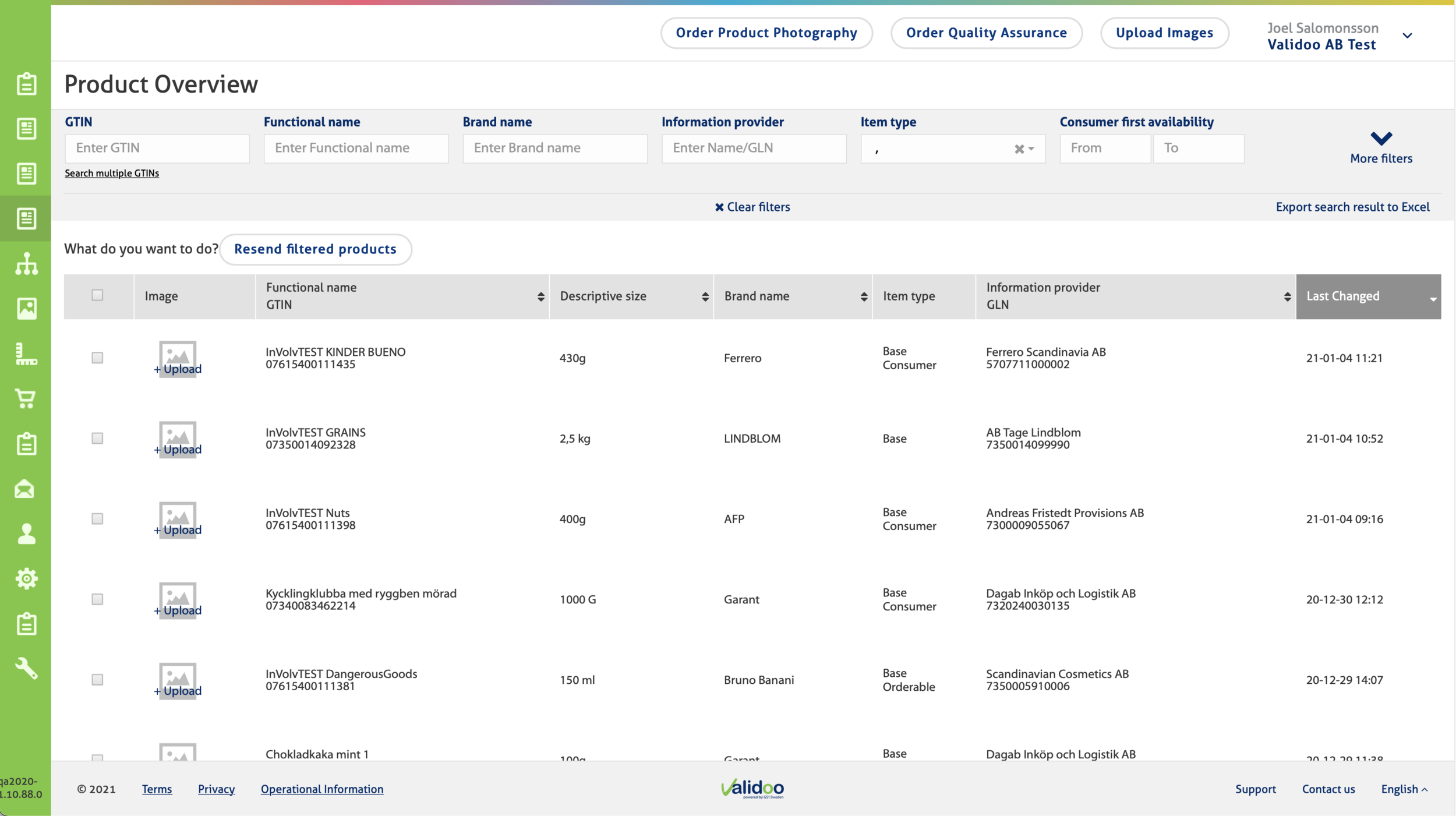
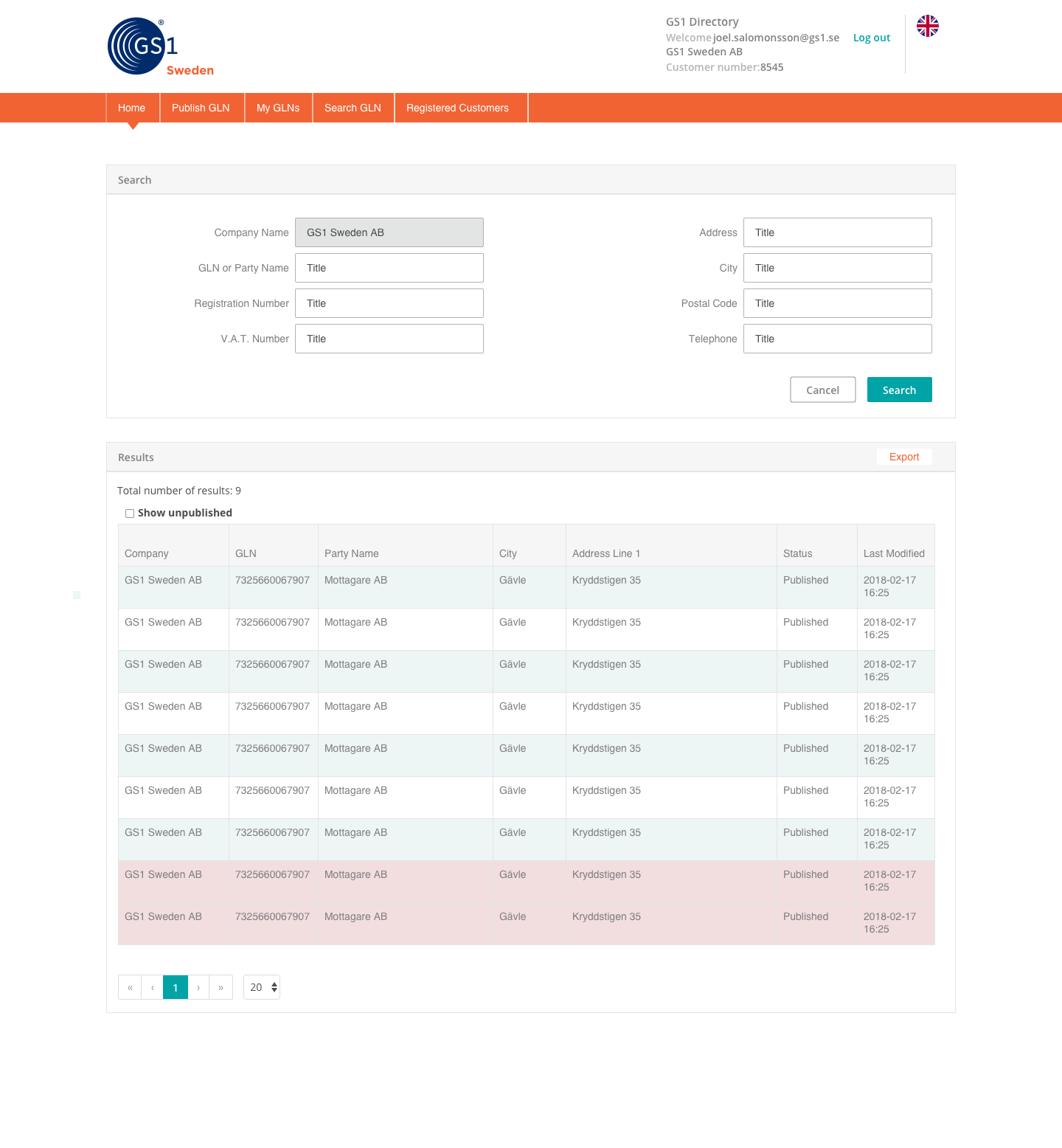
Here are some snapshots of our current products. Not only are we using different styles in our components, but also different interaction models. Validoo is using the fullscreen application design and the customer portal and Directory using a classic website design. While both interaction models are fine, our users do not even know that these products are from the same company.

Audit
To work out what we had and what we could use, we needed to audit our components. Since we had contractors design and develop the customer portal and Directory products, I had to recreate all of the views and components from scratch to overview what we had. This helped us find redundant components and gave us site maps and documentation for our products in case we needed to make smaller changes before we can switch to the new design system.
Inspiration
"Good artists copy, great artists steal" is an excellent quote from Pablo Picasso. This is a great mentality when designing a new system in a small team. Why spend time and resources trying to create something new and unique when your users will become more familiar with the look and feel of something they are already using every day. So, we used some of the more popular design systems used in the industry today as inspiration while we tweaked our components and patterns.

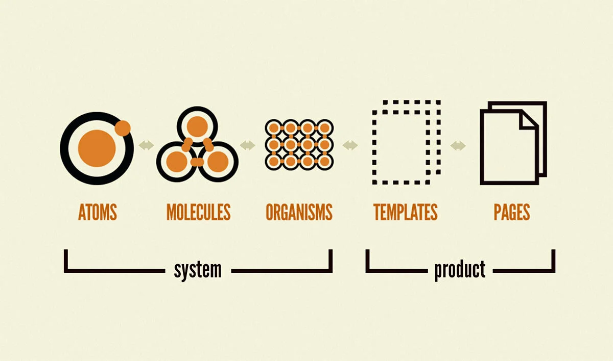
Atomic Design Methodology
To simplify the creation of new components and future edits, we decided that using the Atomic Design approach was the best model for us. This allowed us to iterate quickly with rougher components and easily tweak the style without going through all views and documents that they were used in.
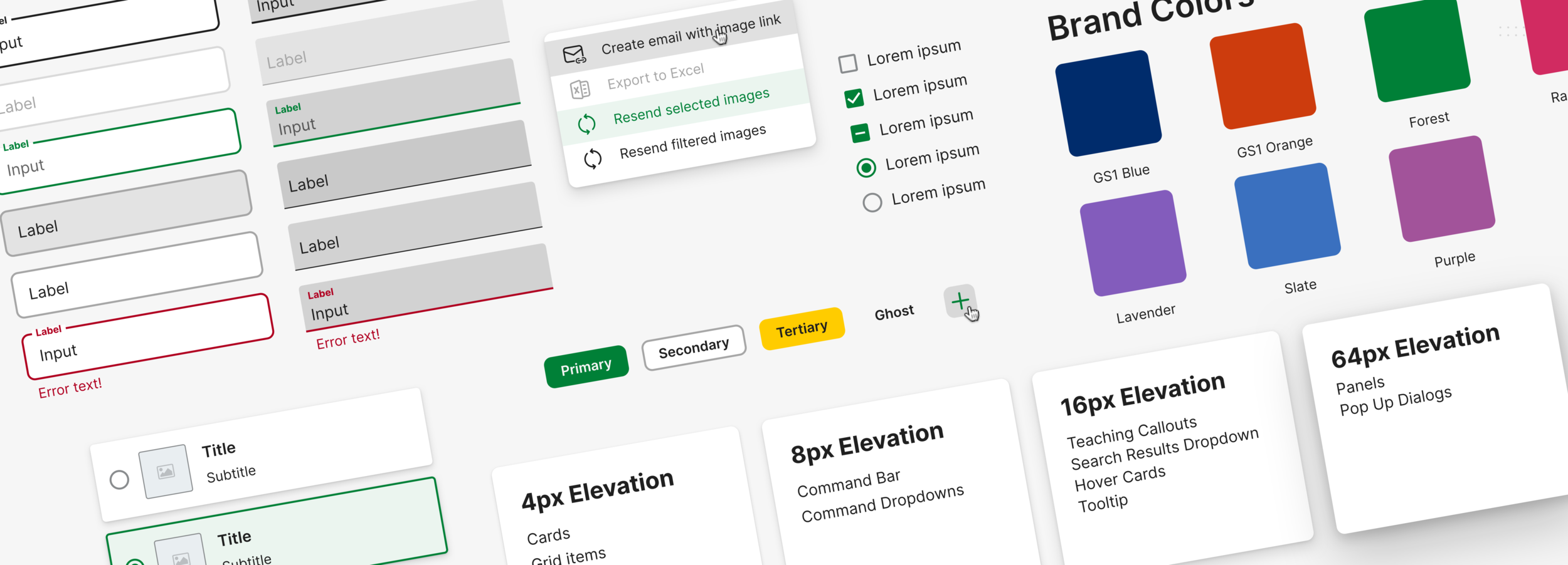
Components
Now, most apps and websites today are built using a multitude of components for various functions. I could show all of the components and states that we designed, but that would be a lot of scrolling. Instead, I will show a few of them to showcase the visual style that we decided to go for.
Brand Colors
Since GS1 Sweden is a member of the global GS1 organization, we have some guidelines to follow. While design had not been a significant focus for the global organization, we did get some new adapted colors to work with that are adjusted for screen design instead of print. These are the colors that we can now adapt to our products to differentiate them while keeping a familiar feel.

Buttons
We decided that we needed to use three sets of buttons. However, with some stakeholder feedback, we added the tertiary button as a special case for having a status color as a fill. (this one is only used in internal or admin views.)
The primary button is used for primary things such as continuing to the next step or approving a setting.
The secondary button is used for most secondary actions inside cards or popups.
The ghost button is used above cards or data tables but is never nested inside another component such as dialogs or cards.

Text Fields
We decided to use the material design text fields for text fields after reading their research on text field design and usability. They also look modern and fit with the overall design language we are aiming for. We decided to use both the filled style and the outlined style for different tasks. The filled style is used only for filtering our data tables and other search results, while the outlined text fields are used for forms and other user input that does not search or filter any data. This way, we can help our users to understand what the major actions are in a view quickly.

Toggles
When it comes to toggles, there is not much differentiation between the standard checkboxes and radio buttons. They all look similar, and we chose to go with the material library here as well. However, when it comes to larger radio buttons with text and images, we had to go with a more custom solution. The component is flexible depending on what information we have to show and what surface level we have placed it in.

Surfaces
Inspired by the popular design systems used today, we decided to add depth to our surfaces to communicate the spatial relations between groups and objects in our design. Surfaces are not only distinguished by their background color but also the elevation or depth it has.

Navigation
To simplify our designs, we decided to keep using the left-side navigation menu used in Validoo. However, with a redesign to work better with mobile devices and with our branding of different products. Instead of having the brand color in the left navigation, it has moved up to the header, leaving the brand color in the menu items themselves while in their selected state. This allows us to give our products a more visual balance compared to the current left-heavy design.


Fonts
Since all of our products are designed by different contractors, the font choices have differed as well. Right now, we have a mix of Aller, Myriad Pro, and Open Sans. While all of these fonts are great on their own, we decided that we needed "one font to rule them all". We chose Inter as our font since it has been designed to be used with screen designs and has excellent readability of mixed-case and lower-case text.

Icons
Our goal is to have our own custom icon set tailor-made to our needs when it comes to iconography. However, while the branding strategy work is being completed parallel to this project, we decided to use the fluent icon set to switch over to our own.
Templates
While I can't show the final designs in this chapter, I can show the templates that show the interaction models of our designs.
Detail View
For the detail-view, we need to show a lot of data without confusing the users. We decided to go with a pattern where we place informational categories inside their cards. We then keep the most important categories to the left side of the view, putting the rest to the right in a scroll section. The advantage of using cards is that it is easy to play around with the order and stack them when the browser width gets too small, making the full view a scroll view.

Navigation Table
We are replacing the current design of using tabs to navigate between different sections of a view. We found in our audit that depending on the language used and the browser's width, the tab bar would get stacked and lost readability. Our solution is to have a navigation table to the left of the main content instead. This allows us to keep our designs consistent no matter the screen width and increases usability with many navigation items.

Modals
We use three different sizes of modals in our system, depending on the functionality needed. The small modal is used for notifications such as warning the user that exiting a view will cause data loss. The medium modal is used for most modal functions, such as uploading files or adding multiple rows of text to a filter. The large modal is used for actions that require more space but do not need their views. An example of this is the settings view or the represent-feature for internal admins.


Filters
In most of our products, there is a lot of information that our users need to filter. Through some user testing, we found that our users frequently use multiple filters when using our products, making it difficult to keep track of the filters used. We decided to keep the filters visually separated inside of a card with tags for the filters displayed below.

Data Table
The data tables are inspired by the material design guidelines with its white card as a background and the 32pixel spacing between columns. One thing that we changed is sorting. Since we can have multiple items you might want to sort for in a single column, we decided to have a dropdown above the data table instead of sorting in the column header. We also have the legacy pattern of having multiple data points in a single cell that we have to keep. This makes sorting from the header very complicating from a developer standpoint and confusing from a user standpoint.

Next Steps
While we are not finished with the design system, we have launched the initial implementation with our new service, ProductSearch. We are continually building and tweaking the design of our components as we are implementing them into our other products and are planning on launching the complete system in 2021.